

Volga Volga Brand Identity Refresh
Branding agencies and design studios often keep a low profile when it comes to their own visual identity, with minimal external representation and limited interaction beyond their logos. On one hand, this approach aims to avoid distractions from showcasing their portfolio, on the other hand, it's often due to time constraints.
This year marks our agency's 20th anniversary, and we wanted to treat
ourselves to something special.
We decided to refresh our corporate identity by updating our logo, which has remained largely unchanged over the years, and to develop a brand graphics system to enhance the aesthetic appeal of our communications. Virtually the entire design department participated in this task.
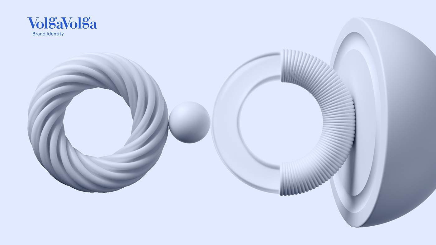
The design concept is built on a dynamic layout scheme inspired by the principles of the Swiss school. Typographic solutions are combined with simple geometric shapes, while meaningful accents and a serene, structured vibe are provided by abstract 3D graphics. The character and openness are emphasized by bold and slightly ironic illustrations reminiscent of marker-drawn graffiti.


We wanted to convey and visualize the design process, linearly and abstractly on one hand, as we all search for that "golden ratio," strictness, and regularity, and combine it with the internal aspect of balance, equilibrium, and multidimensionality, adding a touch of humor, because, frankly, it's hard to do without it.
As a result, we achieved a functional and versatile style, much like our team itself.
As a result, we achieved a functional and versatile style, much like our team itself.


